
How to Choose the Right Logo for Your Company | oofbeat
How to Choose the Right Logo for Your Company: Helpful Tips from oofbeat
In today’s competitive marketplace, your logo is more than just a symbol—it’s your business’s first handshake with the world. At Oofbeat, a top-tier digital design agency, we know just how crucial it is to get this right. From web design to visual identity design, your logo lays the foundation for a memorable brand experience.
Whether you're starting fresh or considering a rebrand, this article walks you through 17 powerful tips on how to choose the right logo for your company. You'll learn from expert-backed strategies, psychological principles, and best practices used by industry leaders and professional branding agencies.
Understanding the Importance of a Logo
First Impressions Matter
Your logo often provides the first impression of your brand. Research shows that people form judgments in mere seconds—your logo can either draw people in or turn them away. A professional, well-thought-out logo sets the tone for everything that follows in your branding.
Why a Logo Is Central to Brand Identity
A logo acts as a visual anchor. It ties together all branding efforts across platforms, from websites and social media marketing to packaging and advertising. It’s the symbol that sticks in people’s minds when they think of your business.
The Psychology Behind Effective Logo Design

Colors and Emotional Impact
Different colors trigger different emotional responses. For example:
Blue conveys trust and professionalism.
Red evokes excitement and energy.
Green is associated with growth and health.
Understanding color psychology helps align your logo’s emotional tone with your brand strategy.
Fonts and Perception
Fonts aren’t just aesthetics—they shape perception. Serif fonts tend to convey tradition and reliability, while sans-serif fonts are modern and clean. Typography should reflect your brand's personality and tone.
Characteristics of a Great Logo
Simplicity and Memorability
The most iconic logos are simple. Think Nike’s swoosh or Apple’s apple. Simplicity ensures easy recognition and scalability across digital and print mediums.
Relevance to Industry and Audience
Your logo should resonate with your target market and reflect your industry. A playful design might suit a toy brand but could undermine a law firm’s credibility.
Key Types of Logos to Consider
Wordmarks and Lettermarks
Wordmarks: Logos based on the brand name in stylized type (e.g., Google).
Lettermarks: Initial-based logos, ideal for long or complex business names (e.g., IBM).
Pictorial and Abstract Logos
Pictorial: Icons that represent real-world objects (e.g., Twitter’s bird).
Abstract: Geometric or symbolic designs with no literal meaning (e.g., Pepsi).
Emblems and Combination Marks
Emblems: Logos enclosed in a shape or badge, often traditional (e.g., Starbucks).
Combination Marks: Merges text and symbol for a flexible and comprehensive brand mark.
Aligning Your Logo with Brand Strategy
Reflecting Brand Personality and Values
Your logo should encapsulate your company’s core values. Are you playful, professional, eco-conscious, or innovative? Your logo design should express these traits visually.
Considering Your Target Audience
Think about the demographics and preferences of your customers. A logo that appeals to Gen Z might not resonate with Baby Boomers.
How to Research Competitor Logos Effectively
Learning from Industry Leaders
Analyze what top competitors are doing. Notice common design trends and successful visual cues in your sector.
Identifying Gaps and Opportunities
Avoid mimicking others. Use your research to identify opportunities for differentiation, which gives your brand a unique voice.
Avoiding Common Logo Design Mistakes
Overcomplicating the Design
More isn’t always better. A cluttered logo can be confusing and hard to reproduce across formats.
Using Generic Icons or Stock Elements
Avoid cookie-cutter designs. Your brand deserves something original and tailored—not a recycled clipart.
Logo Testing and Feedback
Audience Surveys and A/B Testing
Get real feedback. Test different versions with your audience to see what resonates most. Use social media and email to gather data.
Iteration Based on Feedback
Don't be afraid to tweak your design. Iteration is part of the creative process that leads to the strongest outcomes.
Choosing the Right File Formats and Scalability
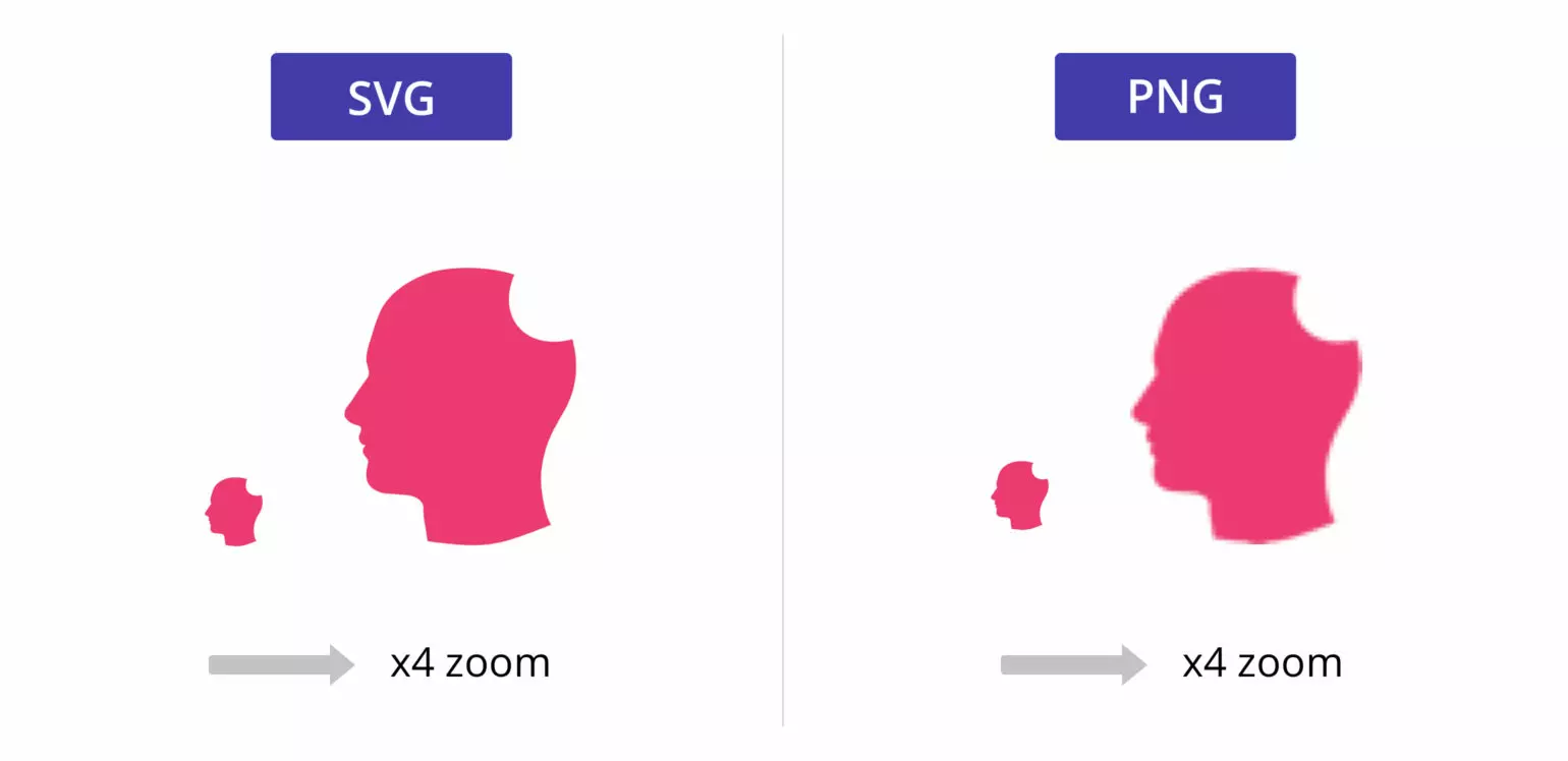
Vector Files and Print Compatibility
Your final logo should be delivered in vector formats (like .AI, .SVG) to maintain quality at any size. Include web-friendly formats too (.PNG, .JPG).
Responsive Logo Versions
Design alternate versions of your logo for different uses—horizontal, vertical, icon-only, etc.—so it adapts across platforms.
Logo Placement Across Digital and Print Media
Website, Social Media, Packaging, and More
Make sure your logo shines on your website, social media banners, product packaging, and digital ads. Consistency here builds trust and professionalism.
Visual Identity Consistency
Ensure your colors, typography, and layout rules are consistent across all brand assets—something oofbeat’s visual identity design services specialize in.
When and How to Rebrand
Signs It’s Time for a Logo Redesign
If your logo feels outdated, confusing, or doesn’t reflect your growth, it’s time to consider rebranding services.
The Role of Rebranding Services
Our team helps you modernize and reposition your brand with updated visuals, messaging, and a clear strategy that reflects your current vision.
Making a Lasting Impression with Your Logo
Go on, make the first move.
Contact Us
Contact Us
