Chaarmology
Reimagining the homepage for a handmade jewellery brand.
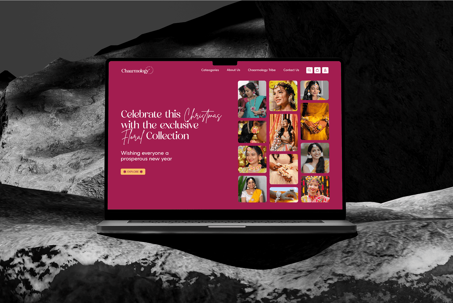
A homepage redesign for a handmade jewellery brand — blending soft visuals, clean structure, and thoughtful details to create a smoother, more elegant shopping experience.

Project details
Chaarmology was in the middle of a rebrand — and the old homepage no longer reflected its elegance. The goal? A cleaner, more elevated storefront that felt personal, confident, and easy to explore.
I started by mapping out the customer journey: how they browse, what slows them down, and what helps them convert. I studied packaging, visuals, and competitors to understand what made the brand unique — and how that could be translated into design.
The new homepage introduced a more refined structure, paired with subtle floral motifs and a white backdrop to let the pieces shine. Typography was stripped back to the essentials for clarity and charm. Testimonials were anchored with solid colours to build trust at a glance.
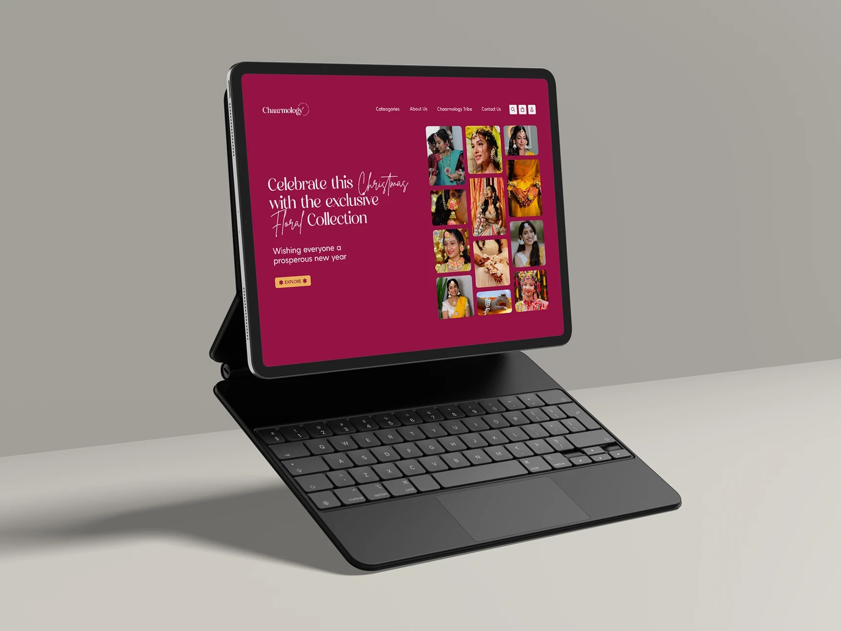
Every element — from navigation to mobile responsiveness — was crafted to feel light, intuitive, and conversion-ready. The result is a homepage that does what good jewellery does: draws you in quietly, and leaves a lasting impression.
Go on, make the first move.
Contact Us
Contact Us
